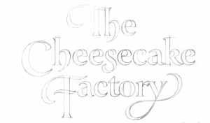
Today I want to post about the award-winning and prolific letterer Doyald Young. If you don’t know his name, I am certain you will recognize his work. Below are just two of the logotypes he has created. He teaches at the Art Center School of Design in Los Angeles and he has authored three books – more on his books in Part 2 and 3 of this post later this week.
I recently came across his work in an interview: Doyald Young on lynda.com and I immediately recognized it. Not just because of his logotypes for high profile clients like the Cheescake Factory and Prudential, but also for his lecturing across the circuit of graphic design professional organizations such as AIGA, the Art Directors Club and the Type Directors club. But in my opinion, his greatest work is the script lettering that he executes so seamlessly. Unlike calligraphers, he uses a pencil to draw the letterforms not a brush or crow quill pen. You can google his name for examples or stop by this blog next week when I will analyze some of his work and talk about his process.
TEASER: I just had to show this – just one example of my favorite work by Doyald Young.
If you don’t subscribe to lynda.com (a resource I couldn’t function without and well-worth the subscription rate. As a teacher of graphic design and visual communications, it helps me keep up with the latest technology.) Note: This plug is from the heart, I don’t get a commission for my recommendations. Here is a preview and an introduction to Doyald Young and his work on You Tube:

One of several sketches for the Cheesecake Factory logo by Doyald Young.

Another of several sketches for the Cheesecake Factory logo by Doyald Young.
He was also asked to do a logo redesign for the insurance company Prudential – here is the original logo with the sans-serif face:
Prudential told him they wanted the logo to be “more friendly” he explained in an interview and for this reason he decided to use Century 725 as the typeface to base his design on. His reasoning was that Century Schoolbook, a typeface that was widely used throughout the 20th century and is still used to this day in text book design, was familiar to the public. Below are some of the sketches and an explanation of how he altered the typeface to suit the new Prudential identity :
Here is his pencil comprehensive (top) and the original typeface (bottom).On close examination, you can see he elongated the P and refined the curve to make it more pleasing and legible. He extended the height of the letters (they are now taller) and slightly extended the serifs and refined the curve of the serifs.
You can observe the difference in the “a” (original is on the left and Doyald’s is on the right).The best way to observe the change if you are new to visual design is to look at the shapes made by the negative space (empty space) and I think the change will be quite evident.
This “t” illustrates how the letters were extended and the curves were refined.
Here is the final logo that Prudential Insurance approved.They were so pleased with his work that they commissioned him to design an entire font for them. Here is an example of the upper and lower case.
Please stop by next week for Part 2 of this blog post about Doyald Young an octogenarian whose work transcends time.


